
Discover what is wayfinding interior design and how it enhances navigation in spaces, making every journey intuitive and seamless.


Wayfinding interior design is defined as the strategic discipline of creating spatial cues, architectural features, and visual systems that allow people to navigate built environments intuitively. Distinct from simply placing signs on walls, it is a coordinated design discipline spanning architecture, graphic design, digital interfaces, and sensory elements such as lighting and materials. Firms like CannonDesign and Signes have long recognised that a well-designed interior should guide you from entrance to destination without you consciously registering the effort. Whether you are planning a home renovation, designing a retail space, or studying interior design, understanding how wayfinding works transforms the way you think about every corridor, junction, and room transition.
What is wayfinding interior design and its core components?
Wayfinding, as a concept, describes three distinct but related things. Wayfinding itself is the human activity of spatial problem-solving: how a person orients themselves and plots a route through a space. Wayfinding design is the professional discipline that shapes environments to support that activity. A wayfinding system is the implemented toolkit, including directional signs, colour coding, maps, landmarks, and accessibility solutions, that makes the design tangible.
The components of a wayfinding system fall into four layers. Environmental cues include architecture, materials, and spatial layout. Graphic elements cover signage, symbols, and typography. Digital layers incorporate interactive directories, apps, and digital screens. Sensory cues use lighting, acoustics, and texture to guide movement without a single word of instruction. A hospital corridor that shifts from warm timber flooring to cool grey tiles signals a zone change as clearly as any sign. That is wayfinding in interior spaces working at its most elegant.
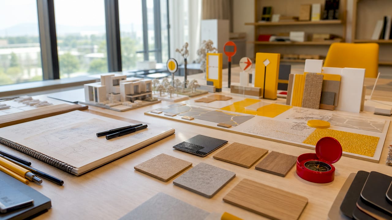
Understanding these layers matters because the most effective wayfinding systems are barely noticeable. They guide users naturally through spatial cues without stopping to search for signs, reducing cognitive load and making spaces feel intuitive rather than confusing.
What are the fundamental principles of wayfinding design?
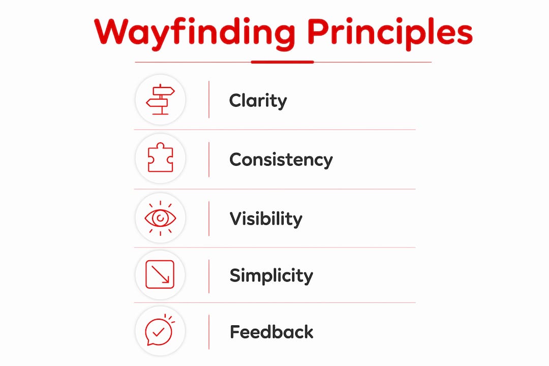
Strong wayfinding design rests on a set of principles that apply equally to a private home and a public hospital. When these principles are followed, users feel oriented and confident. When they are ignored, even beautiful spaces become frustrating to navigate.
The core principles include:
- Visual hierarchy: Information must be layered so the most critical cues, such as exit routes or primary destinations, are immediately visible. Secondary information follows once the user is oriented.
- Consistent terminology and symbols: Using the same language, icons, and colour coding throughout a space prevents confusion. A fire exit symbol that changes style between floors undermines trust instantly.
- Landmarks and distinctive cues: Memorable features, a striking artwork, a change in ceiling height, or a distinctive material, act as mental anchors that support memory and orientation. Research by CannonDesign confirms that human memory and perception are central variables in how people navigate buildings.
- Accessibility and inclusivity: Legible wayfinding text requires a minimum contrast ratio of 4.5:1 for standard text, with 7:1 recommended for vision-impaired users. Inclusive systems also incorporate tactile surfaces, Braille, audio cues, and multilingual messaging.
- Minimal signage reliance: When architecture and environmental cues are strong, the need for explicit signs decreases. A well-positioned window at the end of a corridor draws people forward without instruction.
Pro Tip: When reviewing a wayfinding design, walk the space as a first-time visitor with no prior knowledge. Every moment of hesitation reveals a gap in the system.
The psychological dimension of these principles is significant. Wayfinding that reduces uncertainty lowers stress and encourages exploration, which matters enormously in retail, healthcare, and hospitality settings. Designing for the average user, however, is a trap. True wayfinding accounts for human diversity including age, literacy, neurodiversity, and cultural expectations, not a single idealised visitor.
Why is wayfinding important in interior spaces?
The importance of wayfinding extends well beyond aesthetics. Poor spatial communication has measurable consequences across every building type, and the data is striking.
In retail environments, poor wayfinding leads to 3 to 5% revenue loss, with up to 40% of shoppers failing to find items they intended to purchase. That figure represents a significant commercial cost for any mall or shop owner. By contrast, malls with interactive wayfinding see 30% more dwell time and a 7 to 15% revenue increase. The implication is clear: spatial clarity is a direct driver of commercial performance.
Healthcare settings illustrate the stakes even more sharply. Hospitals with poor wayfinding lose over $200,000 annually through inefficiency and decreased patient satisfaction. In emergencies, clear evacuation routes reduce panic and save lives. Wayfinding in these environments is not a design preference. It is a safety requirement.
“Wayfinding creates the confidence to get lost, reducing anxiety so users can focus less on navigation and more on engaging with the space around them.”
Beyond safety and commerce, effective wayfinding supports branding and place identity. A space that feels intuitive to navigate leaves users with a sense of confidence and belonging. That emotional response builds loyalty, whether the space is a boutique hotel, a community library, or a family home. For homeowners, this translates into a residence that feels genuinely welcoming to guests rather than confusing or impersonal.
How to implement wayfinding effectively in interior design projects
Implementing a wayfinding system well requires a structured approach. The most common and costly mistake is treating wayfinding as an afterthought. Wayfinding strategy must be integrated during the concept design phase. Retrofitting signs onto a poorly planned layout produces what designers call “signage bandages”: patches that acknowledge a problem without solving it.
A practical implementation process follows these steps:
- Audit the space and user journeys. Map every decision point, entrance, junction, and destination. Identify where users are most likely to become disoriented.
- Define the wayfinding layers. Decide which cues will be environmental, graphic, digital, or sensory. Not every space needs all four, but each layer should be considered deliberately.
- Place signs at decision points. Interior wayfinding signs work best when placed at entrances, lifts, and junctions where choices must be made. Directories belong at entry points; room identifiers belong at destinations.
- Establish a governance framework. Centralised governance treats wayfinding content as a managed asset, keeping all signage and digital tools consistent and current. Stale or contradictory signs erode user trust faster than no signs at all.
- Test with real users. Observe how diverse users, including older adults, children, and people with disabilities, actually move through the space. Their behaviour reveals what the design cannot.
Pro Tip: Appoint a single content owner for all wayfinding information. When signage is updated by multiple parties without coordination, inconsistencies appear quickly and undermine the entire system.
| Approach | Early integration | Retrofit approach |
|---|---|---|
| Cost | Lower overall | Higher due to remedial work |
| Effectiveness | High, cues feel natural | Moderate, signs feel imposed |
| Aesthetic quality | Cohesive with design | Often visually disruptive |
| Flexibility | Designed for diverse users | Typically addresses majority only |
Technologies like interactive directories, mobile apps, and audio navigation aids extend wayfinding into the digital layer. For complex spaces such as hospitals or large malls, these tools are no longer optional extras. They are expected by users and required for full accessibility compliance.
How to apply wayfinding principles across different interior types
Wayfinding looks different depending on the space, but the underlying logic remains consistent. The goal is always to reduce the mental effort of navigation while enhancing the experience of the space.
Residential interiors rely on subtle cues rather than explicit signage. A change from timber flooring to stone tiles signals a transition from living areas to wet zones. Lighting directed toward a staircase draws the eye upward. Material contrasts at thresholds define rooms without the need for labels. For homeowners working with an interior design professional, discussing wayfinding early in the brief ensures these cues are designed in rather than discovered missing after completion.
Retail and commercial spaces demand a more explicit approach. Zoning through colour, ceiling height variation, and floor pattern changes helps shoppers understand the layout of a store or mall intuitively. Interactive directories at entrances reduce the time customers spend searching and increase the time they spend browsing. The revenue data cited earlier makes a compelling case for investing in this layer.
Healthcare environments require the highest level of wayfinding rigour. Calming colour palettes reduce patient anxiety. High-contrast, multilingual signage serves diverse populations. Emergency route clarity is non-negotiable. The accessibility needs across disability conditions identified in recent research confirm that inclusive wayfinding is not a niche consideration. It is the standard.
Office and public spaces benefit from logical spatial layouts that reduce the need for signage altogether. Branded environmental graphics reinforce identity while orienting visitors. Inclusive language on all signage, avoiding jargon and using plain terms, serves the widest possible audience.
| Space type | Primary wayfinding tools | Key design priority |
|---|---|---|
| Residential | Material changes, lighting, thresholds | Subtlety and aesthetic integration |
| Retail and malls | Zoning, interactive directories, floor patterns | Dwell time and commercial flow |
| Healthcare | High-contrast signage, colour coding, audio | Accessibility and safety |
| Office and public | Spatial layout, branded graphics, plain language | Clarity and inclusivity |
For homeowners and designers exploring home and living renovation options, integrating wayfinding thinking from the outset produces spaces that feel effortless to live in and impressive to visit.
Key takeaways
Effective wayfinding interior design combines environmental, graphic, digital, and sensory layers to create spaces that guide users intuitively, reduce stress, and deliver measurable benefits across residential, retail, and healthcare environments.
| Point | Details |
|---|---|
| Define all three components | Distinguish between wayfinding activity, wayfinding design discipline, and wayfinding system tools. |
| Integrate early in design | Wayfinding planned at concept stage costs less and performs better than retrofitted signage. |
| Design for human diversity | Account for age, literacy, neurodiversity, and cultural differences, not an average user. |
| Govern content centrally | A single source of truth keeps all signage and digital tools consistent and trustworthy. |
| Measure commercial impact | Retail spaces with strong wayfinding see up to 15% revenue uplift and 30% more dwell time. |
Why the best wayfinding is the kind you never notice
After years of observing how people move through interiors, I have come to believe that most wayfinding conversations start in the wrong place. Designers and clients reach for signage as the first solution, when signage is actually the last resort. If a space needs a sign to explain itself, the architecture has already partially failed.
The most revealing test I apply to any interior is this: watch a first-time visitor from the moment they enter. Do they pause and scan? Do they backtrack? Do they ask for directions? Each of those moments is a design failure, not a user failure. The best wayfinding experience is barely noticeable, guiding users naturally through spatial cues without a moment of conscious searching.
The other mistake I see repeatedly is designing for a fictional average person. Real spaces are used by elderly visitors with reduced vision, by children, by people who do not read the primary language of the signage, and by individuals under stress who process information differently. Treating these users as edge cases is both a design failure and, in many contexts, a legal one.
Governance is the unglamorous hero of wayfinding. A beautifully designed system degrades quickly when signs are updated inconsistently or digital directories are left to show outdated information. Treating wayfinding content as a managed asset, with a named owner and a review schedule, is what separates spaces that work for years from those that confuse within months. If you are planning a renovation or a new interior, build the governance plan before you finalise the signage design.
— Jonathan
Bring wayfinding thinking to your next interior project
If this article has shifted how you think about spatial navigation, the next step is finding the right design partner to bring those ideas to life. At Tspacemall, you will find a curated selection of interior design specialists who understand that great spaces are as functional as they are beautiful.

Absolook Interior Design and Woodcraft Interior Design are two firms within the Tspacemall community with the expertise to integrate wayfinding principles from the earliest stages of your project. Whether you are renovating a family home in the East of Singapore or fitting out a commercial space, these specialists can translate the principles covered in this article into environments that genuinely work. Visit Tspacemall to explore the full range of interior design and renovation services available and start a conversation with a designer who gets it.
FAQ
What is wayfinding in interior design?
Wayfinding in interior design is the strategic use of architectural cues, signage, colour, lighting, and digital tools to help people navigate spaces intuitively. It encompasses the full system of environmental, graphic, sensory, and digital elements that guide movement through a built environment.
Why does wayfinding matter for homeowners?
Good wayfinding makes a home feel intuitive and welcoming to both residents and guests by using material changes, lighting, and spatial transitions to signal zones and routes. It reduces confusion and creates a sense of ease that contributes directly to how comfortable a space feels to live in.
When should wayfinding be planned in a design project?
Wayfinding should be integrated during the concept design phase, not added after construction. Retrofitting signage onto a poorly planned layout is costly and rarely as effective as designing spatial cues into the architecture from the outset.
What are the key elements of a wayfinding system?
A wayfinding system combines four layers: environmental elements such as architecture and materials, graphic elements such as signage and symbols, digital elements such as apps and interactive screens, and sensory elements such as lighting and acoustics.
How does wayfinding affect retail performance?
Retail spaces with effective wayfinding systems see up to 15% revenue increases and 30% more dwell time compared to poorly navigable environments. Poor wayfinding costs retailers 3 to 5% of revenue through shoppers failing to locate products.
Recommended


